

Accessing the Configuration Interface
To begin configuring your chatbot:- Navigate to your Odin AI dashboard and open your Project
- Go to Public Chatbot on the sidebar menu
- The settings panel has 3 tabs: Appearance, Integrations, and Teams App
Configuration Sections
Appearance
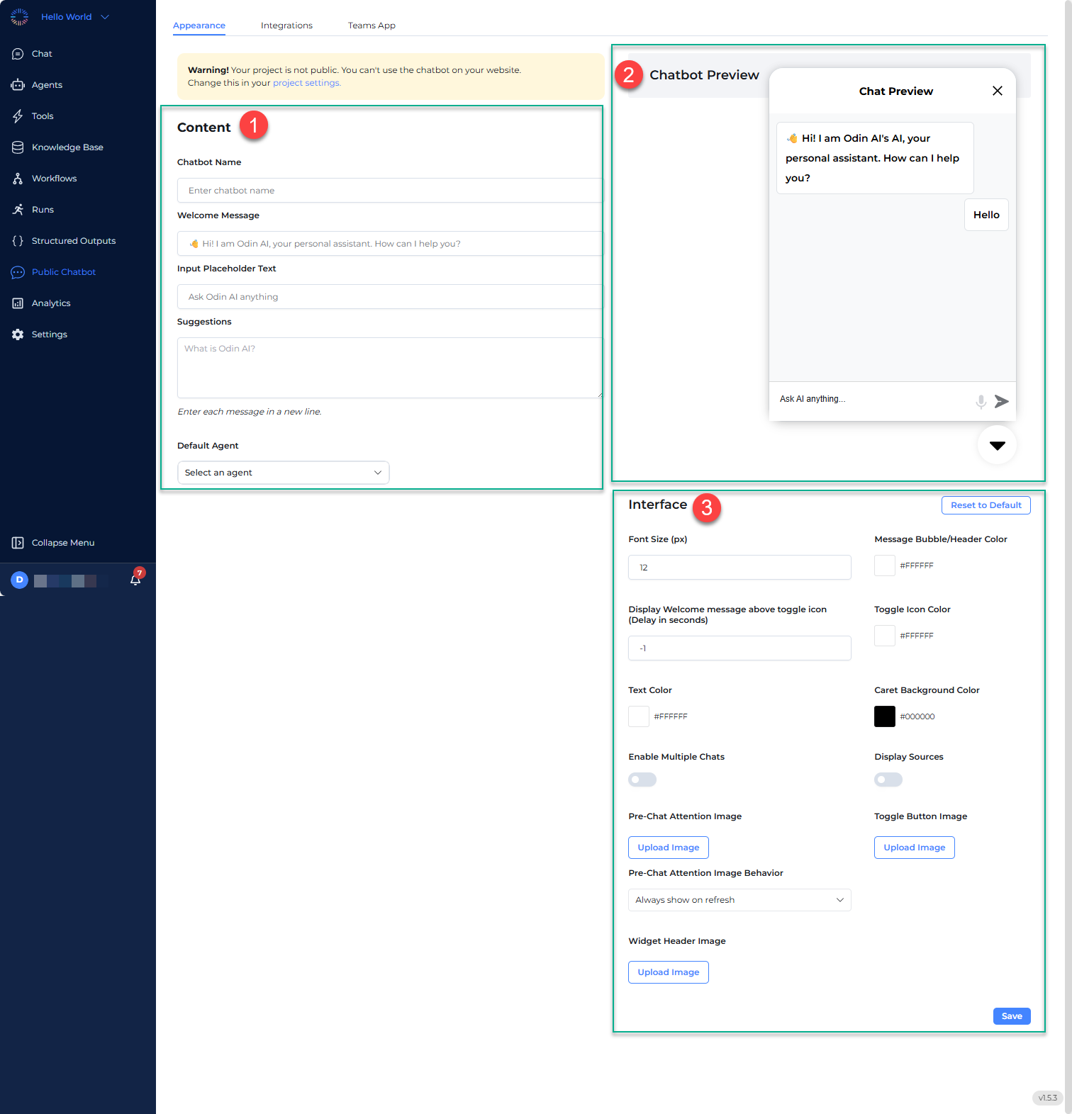
1. Content
The Content section within the Appearance tab allows you to configure basic chatbot settings including its name, welcome message, placeholder text, predefined suggestions, as well as the default agent.- Chatbot Name
- Enter a unique name for your chatbot in this field.
- This name will be displayed in the chat window.
- Welcome Message
- Customize the initial greeting message the chatbot sends to users when they open the chat.
- Example: “👋 Hi! I am Odin AI, your personal assistant. How can I help you?”
- Input Placeholder Text
- This is the placeholder text shown inside the message input box before users type.
- Example: “Ask Odin AI anything…”
- Suggestions
- Add predefined suggested questions to guide users on what they can ask.
- Each suggestion should be entered on a new line.
- Examples:
- What is Odin AI?
- How can I use this chatbot?
- Default Agent
- This section shows the default AI agent handling the chatbot’s responses.
- Click the Select an agent dropdown to select a different agent if necessary.
2. Chatbot Preview
The Chatbot Preview panel on the right simulates the chatbot’s appearance. Any changes made in the Content and Interface sections reflect here in real time. Users can test the chatbot’s initial behavior before saving changes.3. Interface
The Interface section within the Appearance tab allows you to customize the visual appearance or theme of your chatbot. Configurable theme settings include:- Font Size (px)
- Adjust the chatbot’s text size size for readability
- Example: Set to 15 px for a standard chat experience.
- Message Bubble/Header Color
- Customize the chatbot’s message bubble background color using a hex code.
- Example: Set to #000000 for black color or #FFFFFF for white
- Display Welcome message above toggle icon (Delay in seconds)
- Set a delay (in seconds) before the welcome message appears above the chatbot icon.
- Enter -1 to disable the auto-show feature.
- Toggle Icon Color
- Define the color of the chatbot toggle button using a hex code.
- Example: Set to #000000 for black color.
- Text Color
- Set the font color used in chatbot messages.
- Example: Set to #000000 for black color.
- Caret Background Color
- Enable Multiple Chats (toggle switch)
- Enable multiple chats: Allows users to start and manage multiple chat sessions.
- Toggle ON if you want users to switch between different conversations.
- Display Sources (toggle switch)
- Allows users to see the sources of the information they are receiving.
- Toggle ON if transparency about AI responses is needed.
- Pre-Chat Attention Image (image upload)
- Upload an image to display before the chat begins.
- Example: Upload a logo, mascot, or brand asset.
- Pre-Chat Image Behavior (dropdown)
- Always show on refresh
- Never show
- Show every 24 hours
- Toggle Button Image (image upload)
- Widget Header Image (image upload)